The clinic offered world-class care (including house calls and innovative services) but its brand identity was trapped in a clinical, “corporate hospital” aesthetic that failed to connect with Nairobi’s modern Yuppie, Millennial, and Gen Z parents.
The Diagnosis
Competent Care, Cold Communication
Kilimani Children’s Clinic approached The Dusty Spice with a clear operational strength but a significant brand equity gap. They were known for “unrivalled service delivery” and the rare benefit of house calls, yet their visual presence did not reflect this warmth.
Our mission was to build a brand ecosystem so robust that a child would want to visit, and a parent would feel an immediate sense of relief before even stepping through the door.
Visual Identity Crisis: The existing logo was generic. There was no cohesive color strategy, no distinct illustration style, and certainly no personality that a 5-year-old would recognize.
The Disconnect: The clinic’s internal mantra was “fun with great customer care,” but their paperwork and waiting room felt like any other sterile medical facility.
The Real Problem: The brand was speaking at families, not with them. It lacked the “homely atmosphere” promised in its own brand strategy.
reimagining, RENAMING & REBRANDING
The Strategy
The "Kimi Me" Framework
The agency landed on a core insight after analyzing the clinic’s target audience of Yuppies and Millennial parents: They want a partner in the journey, not a dictator of health.
From the client’s own brand definition model, we extracted the strategic pillar:“Kilimani Me” (Kimi).
The strategy was to personify the brand as a “familiar loved one”, a smart, streetwise friend rather than a distant institution.
Every element of the brand book was designed to balance clinical competence (Elegance, Sophistication, Trust) and childlike wonder (Playfulness, Warmth, Curiosity)
DELIVERABLE 1
The Visual Language
From Heartbeat to High-Design
The Brand Book established a distinct visual DNA that moves away from predictable pediatric pastels toward a bolder, more memorable, and recognizable identity.
Color Palette
Courage, Joy, and Elegance
Rose Red: Represents the intensity of service, compassion, and vigor. The Dusty Spice directive: This color signals that Kilimani is serious about care.
Sunbeam Yellow: Represents optimism, new beginnings, and approachability. Rule from Brand Book: Yellow is used to draw attention and signal “fun.”
Black & Warm Grey: Used for sophistication and balance, ensuring the brand never appears childish or unprofessional.
The Signature Logo
The Embrace Heart
The Symbol: A yellow heart whose very outline is formed by the embrace of two abstract figures (a caregiver and a child). This is not just a graphic; it is a visual representation of the clinic’s core value: “The client comes first.”The Logotype: We selected GoodDog (a playful, bouncy font) offset by the clean professionalism of Gotham and Georgia. This typographic pairing is crucial—it says, “We take your child’s health seriously, but we don’t take ourselves too seriously.”
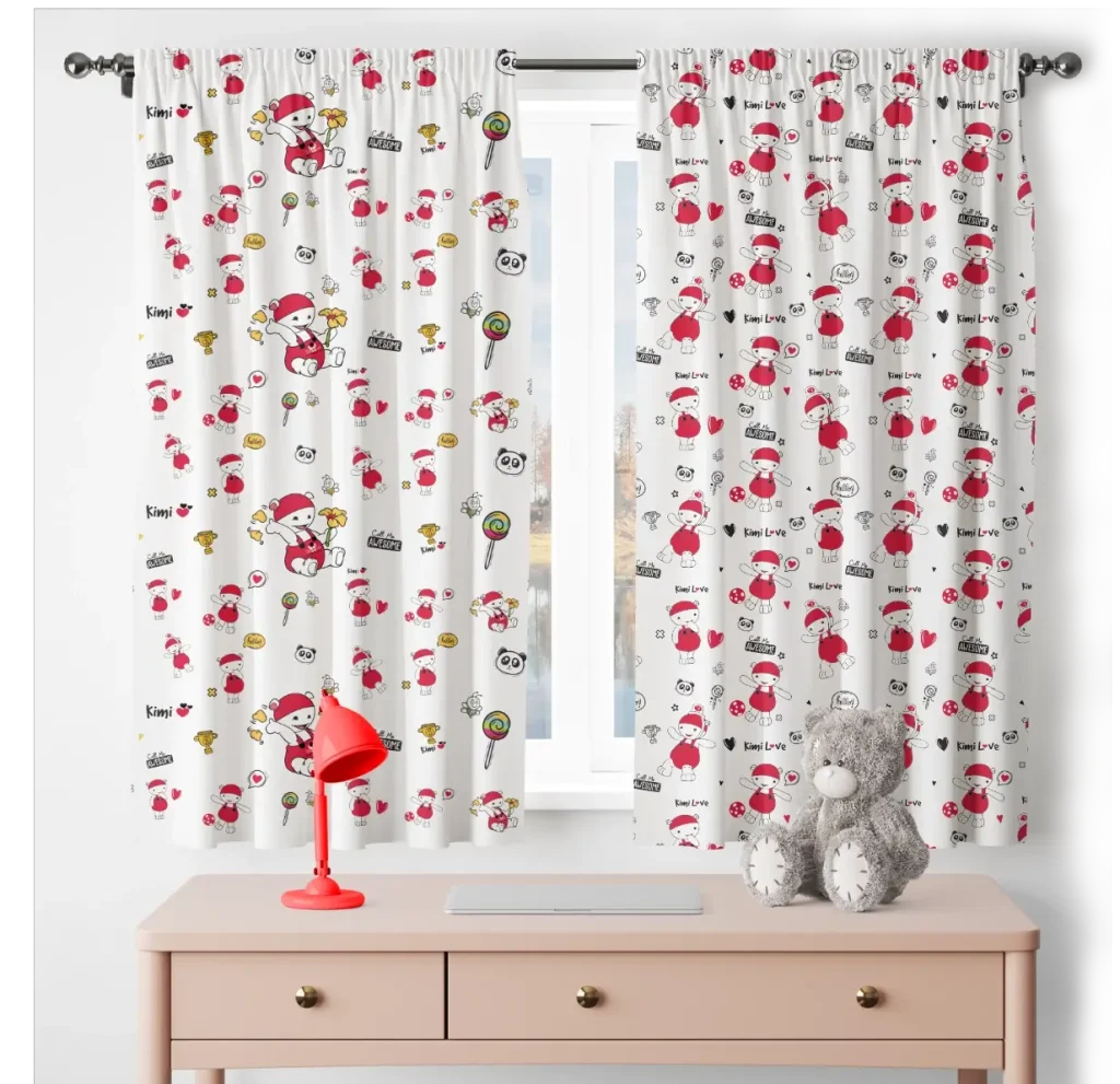
Patterning
The Illustration System
Iconography: We developed a custom set of 16+ line-art icons for services (Dental, X-Ray, House Calls) that maintain a friendly, unthreatening clarity.
Patterns: Derived directly from the “Embrace” logo, we created a concentric pattern system. Guideline: Use sparingly on scrubs, draping, and stationery to create a premium, textile-like feel rather than a cheap print.
DELIVERABLE 2
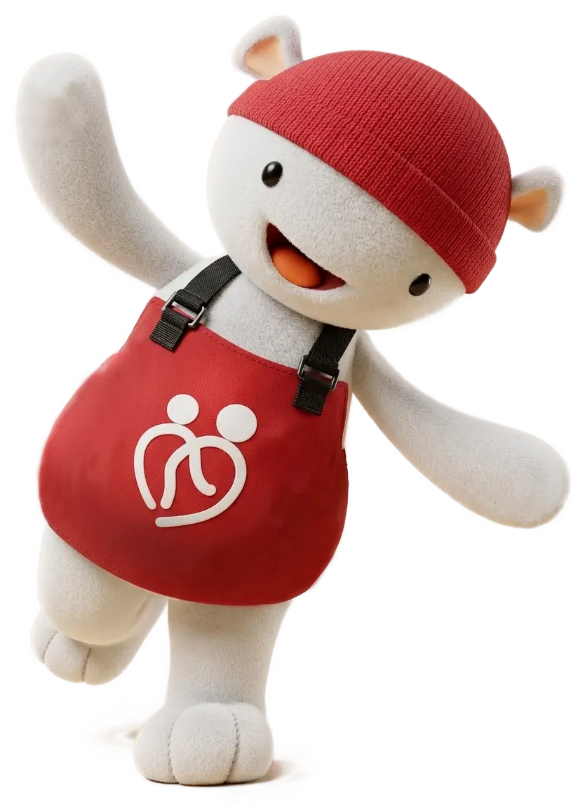
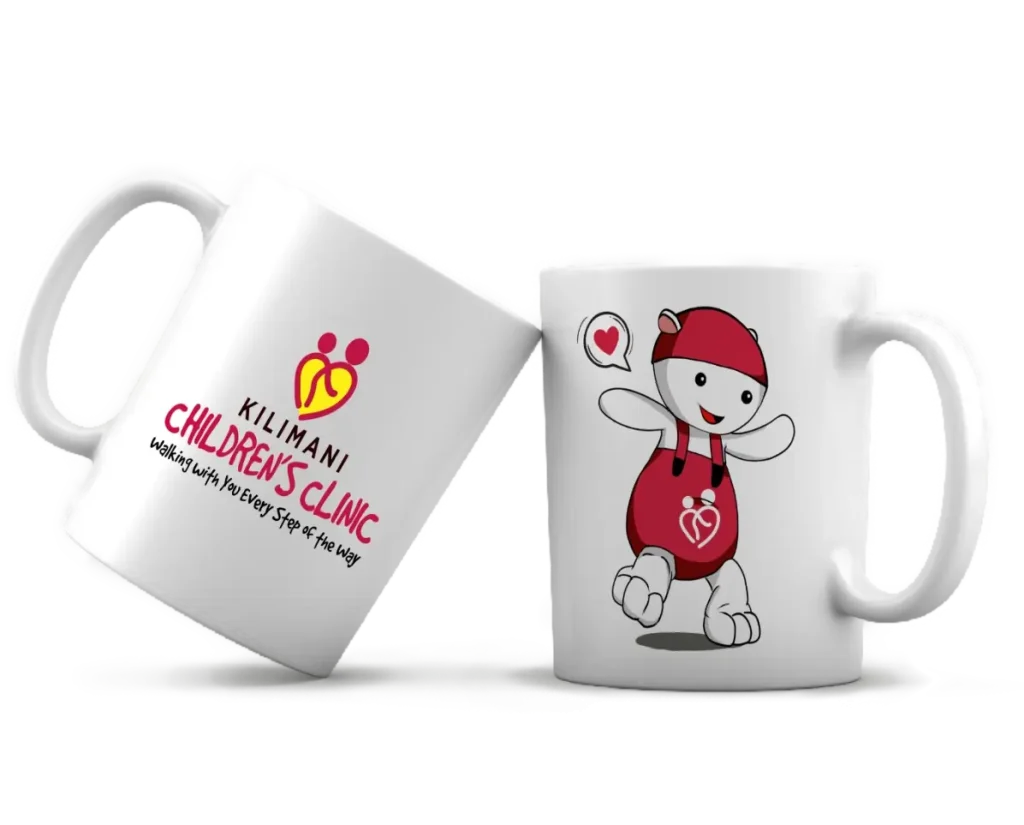
Introducing Kimi
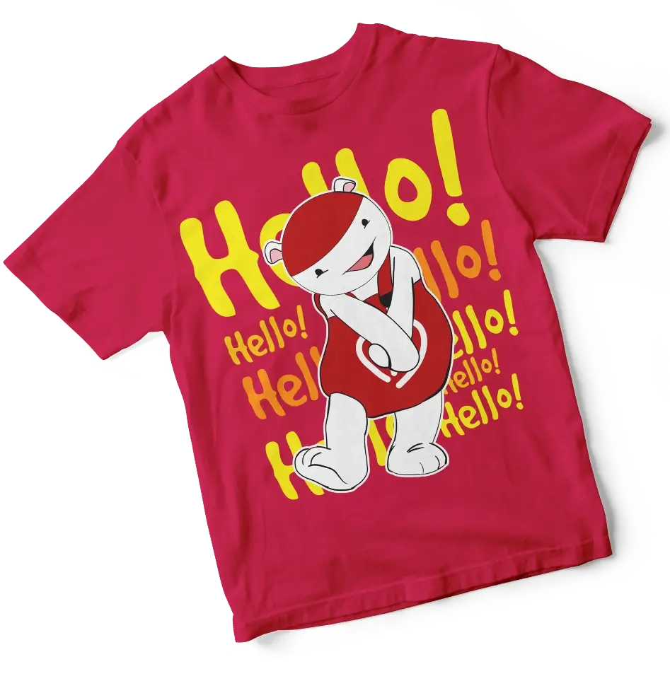
The Street-Smart Super Genius
This was the cornerstone of The Dusty Spice’s rebrand. We moved beyond a generic cartoon animal and created Kimi—a mascot with a distinct personality architecture.
Who is Kimi?
As defined in the Brand Book, Kimi is the embodiment of “Kilimani Me.” He is the underdog kid who is street smart, sneaky, funny, and unpredictable.
The Narrative Twist
Kimi is childlike in speech but has the IQ of a super genius. This allows the brand to deliver complex health tips to parents via a whimsical, non-threatening character.
Visual 3D Execution
We guided the transition of Kimi into 3D representation with strict rules: Kimi must always wear the reverse-white “Embrace” logo on his red outfit to anchor brand ownership and prevent misuse.
DELIVERABLE 3
Tone of Voice
The "Underdog" Translator
The Dusty Spice developed a dual-layered voice system for the clinic.
Scenario 1
Vaccination DayOld/Generic Voice:
“Immunization schedule due.”
New Kimi-Approved Voice:
“Kimi says, it’s you leveled up!”
Scenario 2
Health TipOld/Generic Voice:
“Proper nutrition advised.”
New Kimi-Approved Voice:
“Kimi’s sneaky veggie hack: Hide the greens under the cheese. You didn’t hear it from us.”*
Scenario 3
House Call ReminderOld/Generic Voice:
“Home visit confirmed.”
New Kimi-Approved Voice:
“The doctor is on a secret mission. Destination: Your living room.”*
DELIVERABLE 4
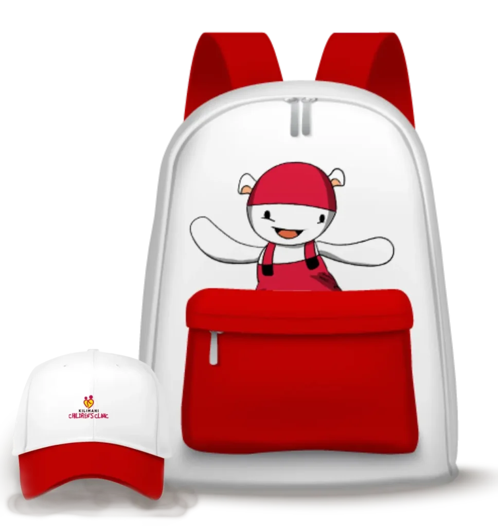
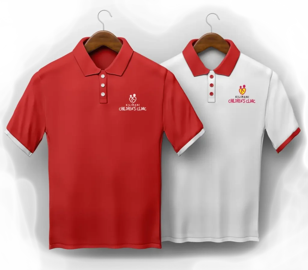
Implementation
Across Channels (ATL, BTL, TTL)
The Dusty Spice developed a layered voice system for the clinic to cater to all channels and platforms that any campaign would embody. The visual design layouts for the information block usage principles versus the key visuals were meticulously structured, and each block was built to balance both information hierarchy and key visuals, without one outdoing the other.
Below are samples of the application scenarios.
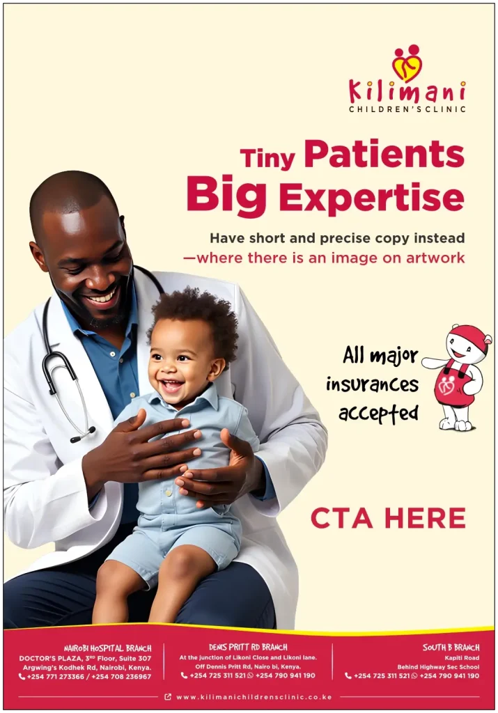
PRINT & DIGITAL
INFORMATION BLOCK – USAGE PRINCIPLES
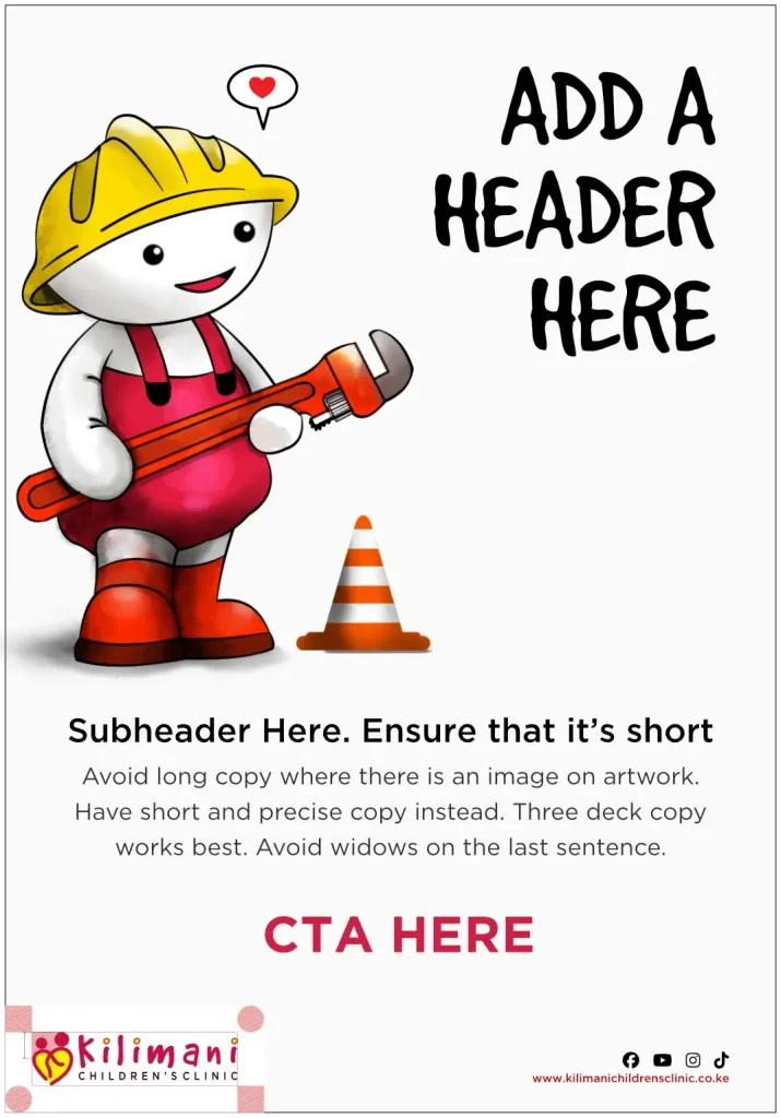
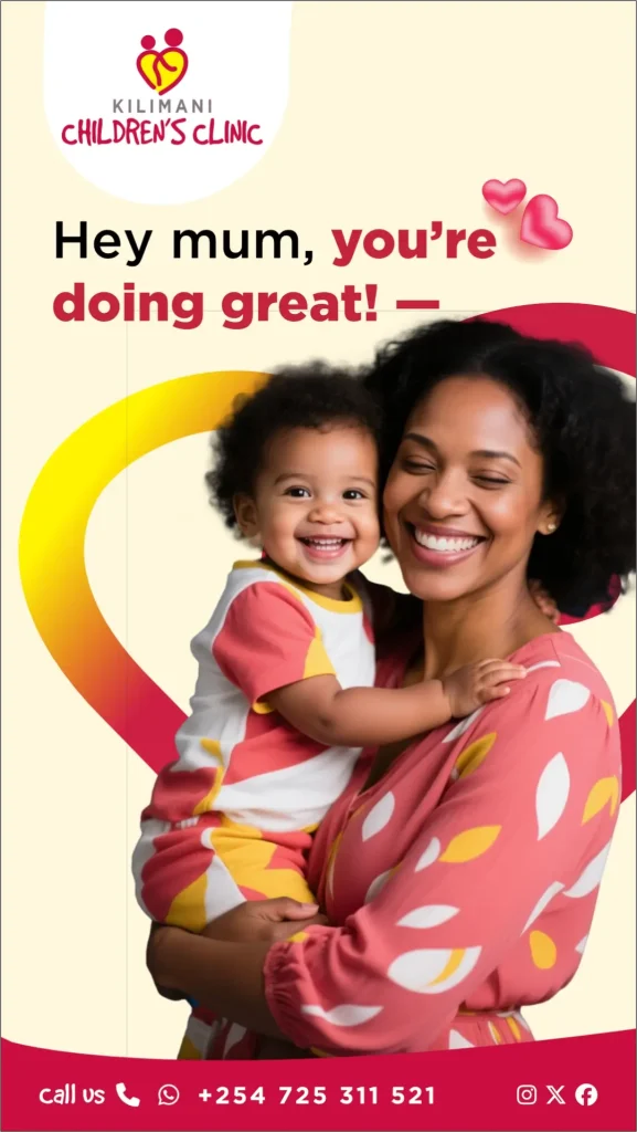
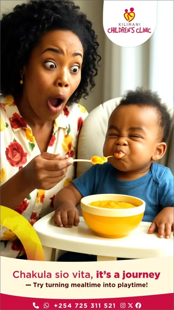
KIMI THEMED POSTER
Image & copy poster
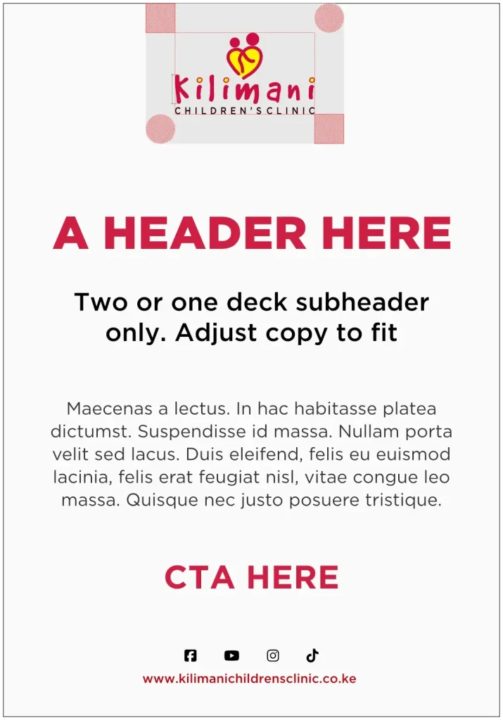
Copy driven vertical poster
INFORMATION BLOCK – SOCIAL MEDIA POSTS
DESIGN LAYOUT 1
DESIGN LAYOUT 2
DESIGN LAYOUT 3-SQUARE
Lorem ipsum dolor sit amet, consectetur adipiscing elit. Ut elit tellus, luctus nec ullamcorper mattis, pulvinar dapibus leo.
DIGITAL VIDEO POSTS – VERTICAL SOCIAL MEDIA VIDEOS
Section 2: The Toolkit — Strict logo clear space rules (using the ‘K’ height), Incorrect Usage “Never Do This” page, Reverse Options on Black/Yellow/Red only.
Section 3: Visual Language & Kimi — Comprehensive guidelines on Kimi’s 3-word descriptors (Funny, Childlike, Intelligent) and when to use his voice.
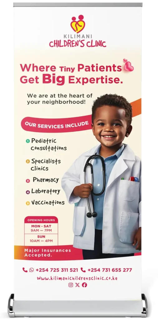
Section 4-7: Application — Layout grids for Letterheads, Roll-Up Banners, Billboards, Scrubs, and Umbrellas.
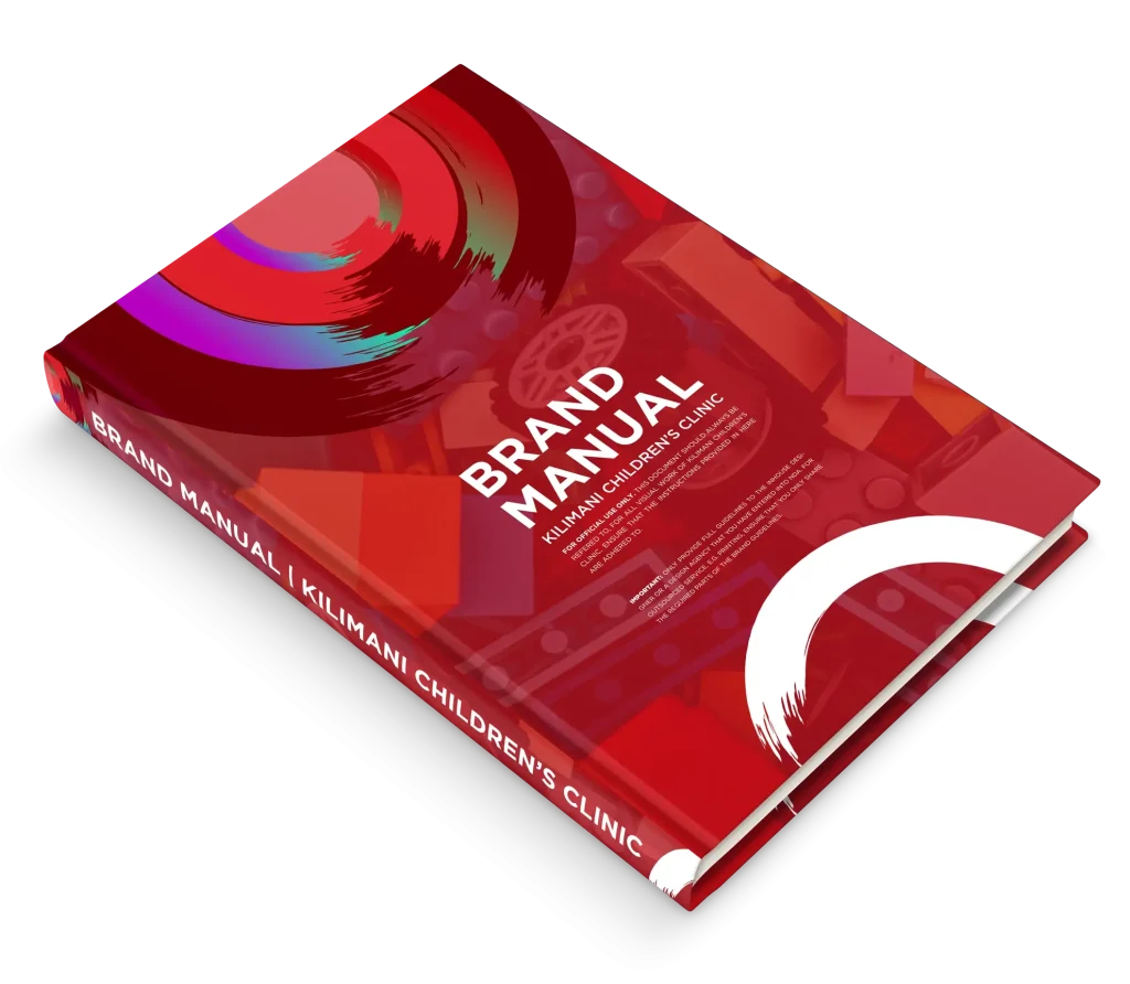
The “NDA” Header: Every page states: “FOR OFFICIAL USE ONLY. THIS DOCUMENT SHOULD ALWAYS BE REFERRED TO.” This ensures the integrity of the visual work is maintained across printers, agencies, and internal designers.
THE PROGNOSIS
THE RESULTS & VALUE
The Dusty Spice’s rebrand of Kilimani Children’s Clinic delivered immediate tangible value
Brand Recognition: The Kimi Mascot has become a recognizable icon in the Kilimani area, with children specifically asking to see “the sneaky red guy.”
Staff Alignment: With a clear Brand Book, the clinic staff now has a unified visual and verbal identity, eliminating the previous “mixed messages” in patient communication.
Marketing Efficiency: The internal team no longer needs to guess how to design a poster or write a caption; the Brand Book provides the exact recipe.
Conclusion: The Kilimani Children’s Clinic rebrand proves that professionalism and playfulness are not opposites; they are a powerful compound. By creating a robust, legally protected Brand Book centered around the Kimi persona, The Dusty Spice transformed a competent medical practice into a beloved community landmark where children feel seen, and parents feel safe.
Ready to reimagine & revatilise your brand?
+254 011 554 5088
To request a call back., click here
Scroll to Top
1
Hi 👋🏾, Welcome to The Dusty Spice. How can I be of assistance?