How Ichigo Treats revamped it's brand to stay competitive.
From a bland brand to an attention-hogging iconic brand. This is the journey of the renaming and rebranding process of an Afro-Japanese fusion spot in Nairobi, Kenya.
industry | food
The Challenge
The client required a total brand refresh of her restaurant. She wanted to modernise the ambience, menu, and the tone and voice to appeal and resonate with her target audience. Previously, it was a ‘shoot, and let’s see what sticks’ approach to the Ichigo Treats brand strategy. Without a cohesive brand language and brand guidelines, the restaurant lacked identity.
The Recon
Goals
We worked closely with the client to develop a comprehensive approach that was creatively driven, cost-effective, and with reasonable deadlines as follows:
Competitive Analysis
Brand Strategy
Creative & Marketing Strategy
Resolve
After intense market research, analysis, and deliberation, we charted a course forward that would give the business a new lifeline by:
Repositioning—the strategy
Renaming—the identity
Rebranding—the execution
reimagining, RENAMING & REBRANDING
THE CREATIVE JOURNEY
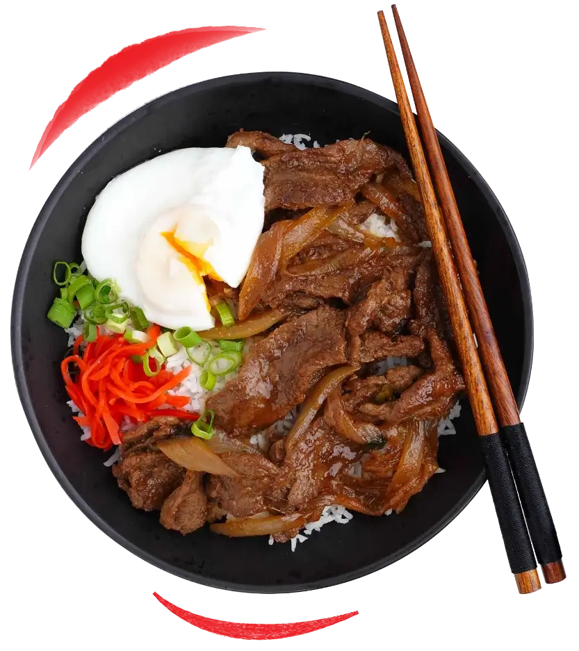
The naming process was pleasantly interesting, since the restaurant’s new menu would be a fusion of Japanese cuisine and African dishes. Having narrowed down on the target market and the location of the restaurant, we leaned heavily on contemporary culture interactions that would connect with the local audience in the most familiar way possible.
MEET ICHIGO
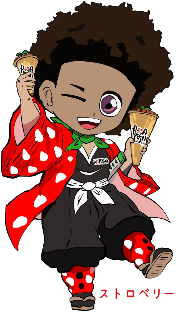
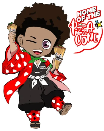
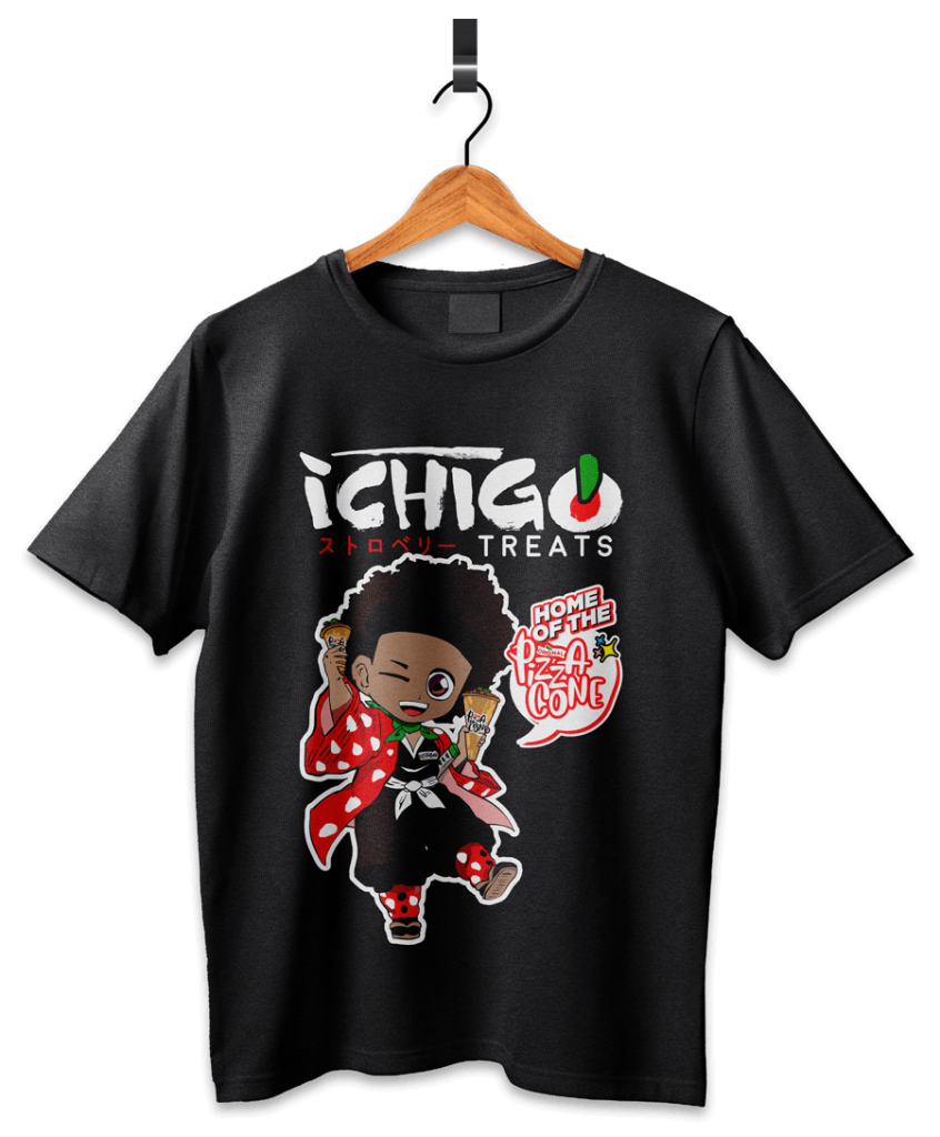
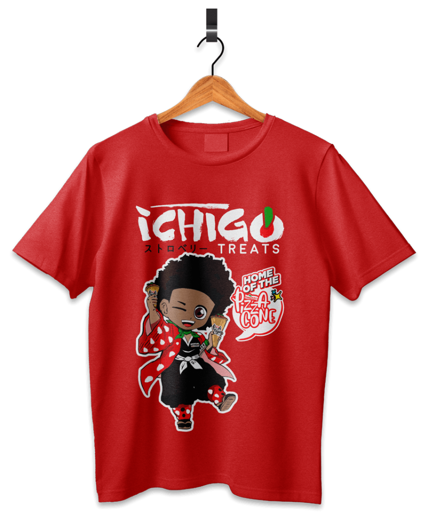
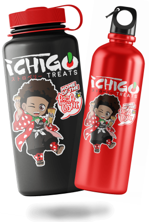
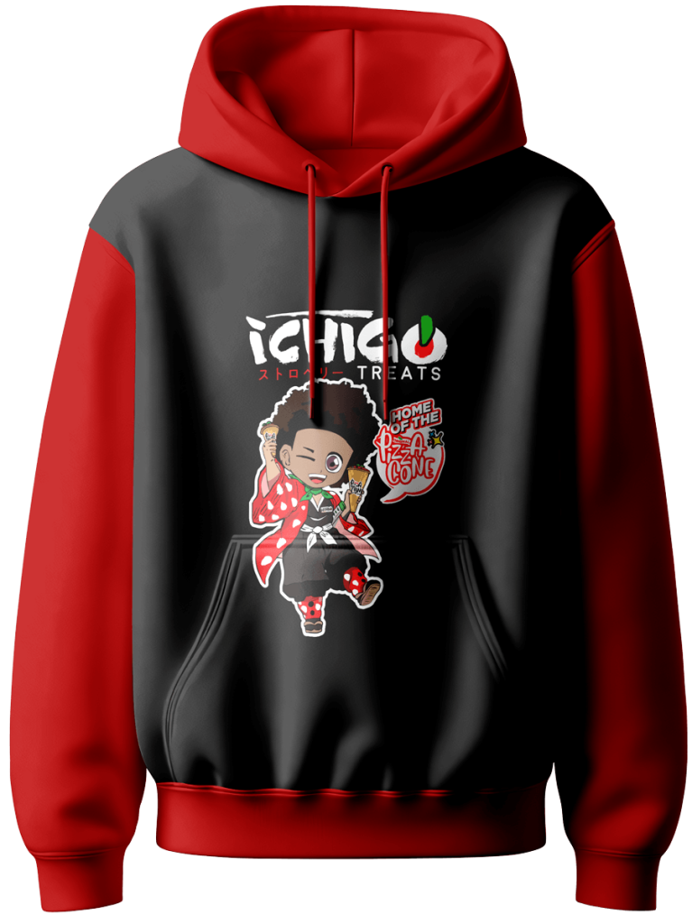
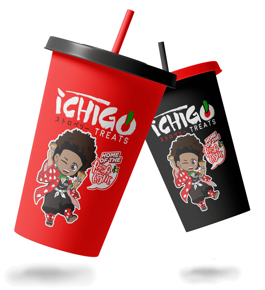
In developing a visual system for this brand, we tried many approaches until we locked in the perfect creative mix—the Mascot would become the anchor for the brand, he was the ‘Big Idea’. We crafted a mascot akin to an anime character, timeless in features and elements, and aptly named him Ichigo イチゴ , a play on the fruit name and a famous anime character 護 , from the anime Bleach.
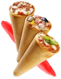
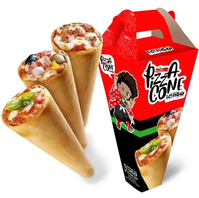
The client introduced a first in Kenya: the pizza cone. She wanted the mascot to embody the fun of the pizzacone, the fun-sized pizza indulgence.
The Pizza Cone
THE LOGO
The logo design was inspired by brush strokes reminiscent of the Japanese watercolor paintings and Japanese calligraphy writing (Shodo). This approach offered an authentic, artistic style that gave a realistic feel, paying homage to the centuries old artform. The aggressive ‘roof’ stroke harmonizes and compacts the logo design.
Logo Main Element
THE BRAND TOUCH POINTS
BEST FOOT FORWARD
The Ichogi Treats brand wasn’t an easy tackle when it came to brand positioning, because it was something new in the market. A fusion of African dishes and Japanese cuisine was seemingly a hard sell. We need a smart and cool way to warm up our target audience to this novelty. Our to-go marketing approach would affect how we built Ichigo Treats’ brand touch points. We needed to allow our audience to try out the fascinating culinary adventure in an immersive, fun experience, and experiential marketing was the way to go. From hosting memorable, fun events to giving meal coupons, the brand was on its way to carving a unique niche in the food and bevarage industry.
TONE OF VOICE
THE MASCOT & THE PIZZA CONE
Ichigo, the mascot, we agreed, would pronounce the Pizza Cone, and the identity of this fun-sized goody would be associated with him. So we designed a speech bubble that would be on one’s face about the Pizza Cone, hence creating awareness of the Pizza Cone in association with Ichigo.
Ichigos tone of voice would be playful (not childish), witty, vibrant and respectufully Disruptive.
Experiential
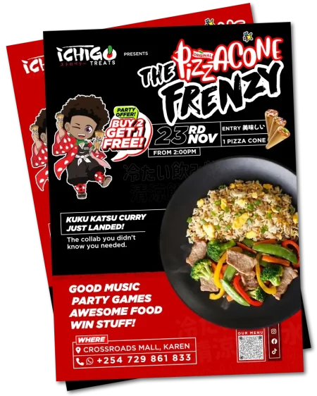
THE PIZZA CONE FRENZY!
Food photography does wonders for selling food, but the absolute way to get customers interested is to have them taste your goodies. To introduce this unique fusion, we created a bimonthly, fun-filled, and exciting event that would allow the potential customers to try the unique Ichigo Treats cuisine at a great discount bundle with BOGOF (Buy One, Get One Free), and with a gift with purchase. The event had games with various dishes as prizes to be won.
EXPERIENTIAL & TOUCH POINT
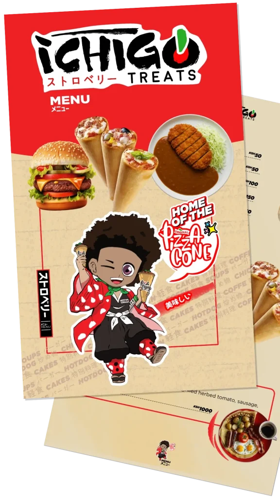
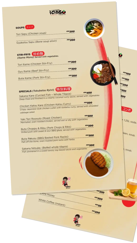
MENU DESIGN
The menu design followed the brand language, ensuring that it maintained the playfulness and Japanese artistic elements like brush swashes and strokes. Some Japanese copy was included, paying homage to the cultural inspiration.
PROMOTIONAL MATERIAL
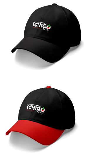
MERCH, GOODIES, FREEBIES!
marketing
THE LAUNCH CAMPAIGN STRATEGY
TOKYO MEETS KANAIRO
The launch was intended as a rallying call for lovers of all things anime, manga, and Japanese. We wanted to create “Form mpya, Otaku ( オタク )”, where the ‘Otakus’ would find a themed space to geek over all things anime while enjoying Afro-Japanese cuisine. The strategy would leverage the anime wave to capture both new and longtime fans. We use a three-phase strategy. The campaign execution was mainly media-agnostic.
PHASE 1
The teaser: Ichigo the Mascot was hinted at using an alias, the ‘Nai-Samurai’. The mascot would drive the campaign. The imagery would be of a human chef (African) wearing an apron under an Ichigo-style haori while holding a katana. The social media posts, posters, and billboards would follow the same art style without revealing the face of the samurai. The key visual was reminiscent of a movie poster (Japanese styled) with the title as the copy: ‘The NaiSamurai’, coming soon, and a launch date. FIGURE OF REACH ETC
PHASE 2
The reveal: A display of a full tilapia prepared in a Japanese style (Tilapia katsu curry), with a wakizashi (Samurai short sword) beside it on the right, and hashi (Japanese chopsticks) on the left. The background was either a solid color, an out-of-focus shot of the ‘NaiSamurai’ standing over as the chef serving, or the table draped in Ichigo-style haori. Each of the key visuals in phase 2 followed this art direction, ensuring consistency in campaign key visuals and storytelling. Copy: ‘The Afro-Japanese fusion spot—Adventure ready!’ with location, social media handles, and contact.
PHASE 3
The CTA: In this phase, we made a full reveal of the Ichigo mascot (The human version) serving a group of upbeat young adults full of energy and excitement, dressed in urban wear that is fused with Japanese urban-style wear, typically what stylish about-town Japanese young adults would wear, then fused with African fashion design and anime elements. The vibrant image sold the culture, the food, and the fun, which was intended to be what Ichigo Treats would be known for. CTA: ‘Form Otaku, jipe shughuli!’with location, social media handles, and contact.
“It felt like I was joining a cult, but I was sold.”
I met with the Tim while he was exploring the mall. He came in for a cup of tea at the restaurant, and as they say, the rest is history.
Our relationship grew organically. I had previously hired other guys to service my brand, but they were inexperienced and after making a quick buck. It was frustrating. When Tim introduced me to The Dusty Spice and explained their philosophy, ethos, and approach to creative work, I felt like I was joining a cult, but I was sold.
Long story short, the journey wasn’t easy, some sleepless nights here and there, but eventually, my restaurant was reborn. Not even my business friends could ignore, and I had to gladly let them join the cult that is The Dusty Spice.
Ready to reimagine & revatilise your brand?
+254 011 554 5088
To request a call back., click here
Scroll to Top
1
Hi 👋🏾, Welcome to The Dusty Spice. How can I be of assistance?